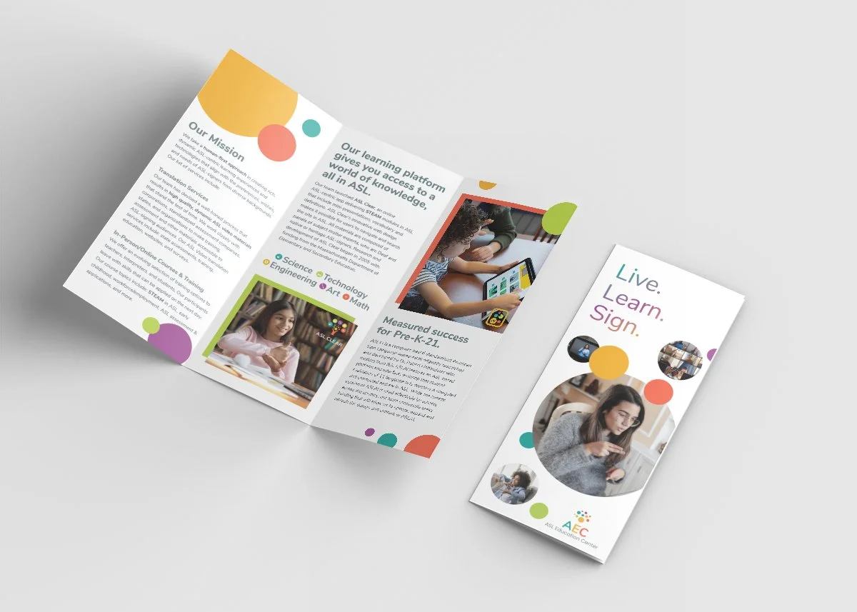
Brochure
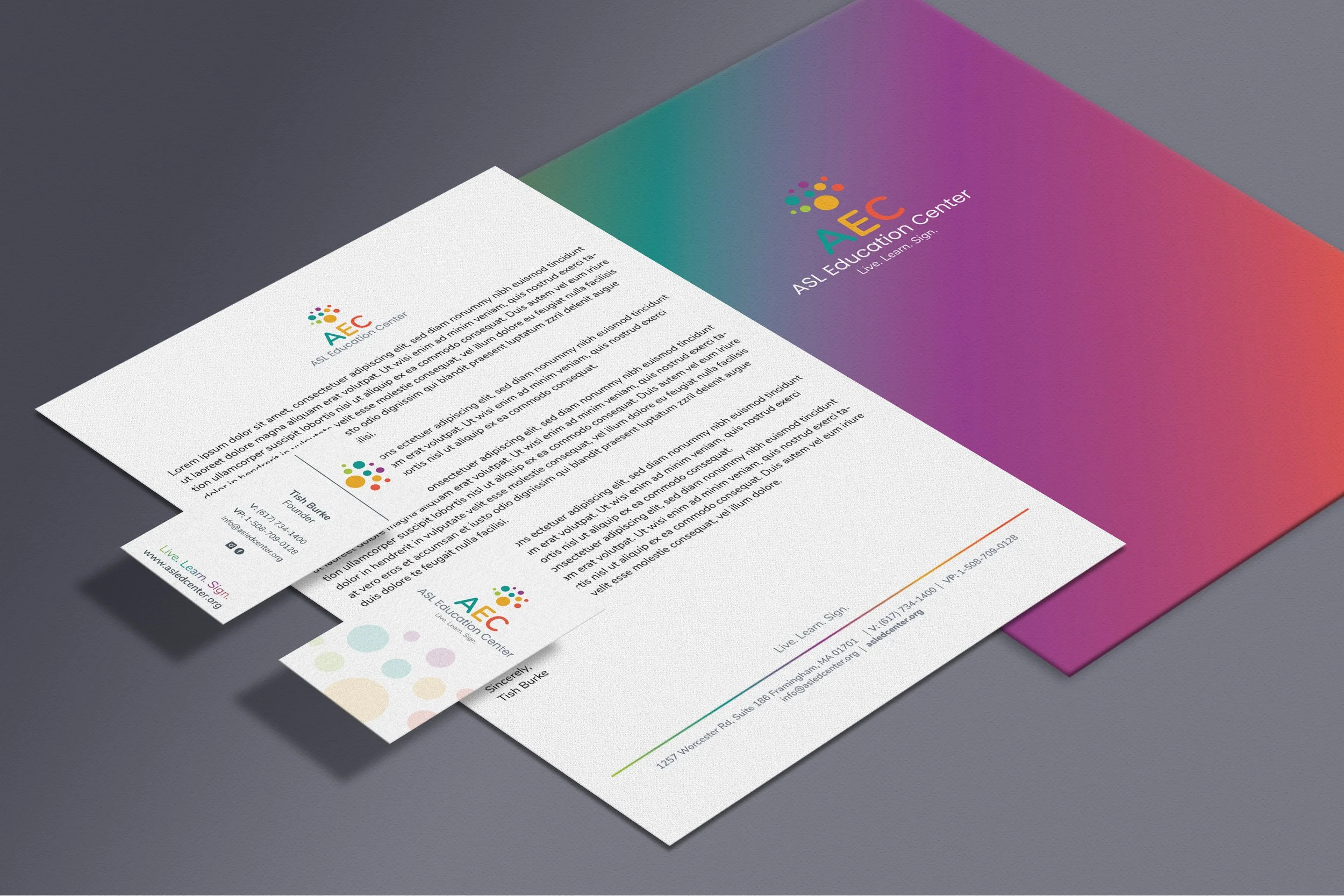
Letterhead, vertical business cards, and folder
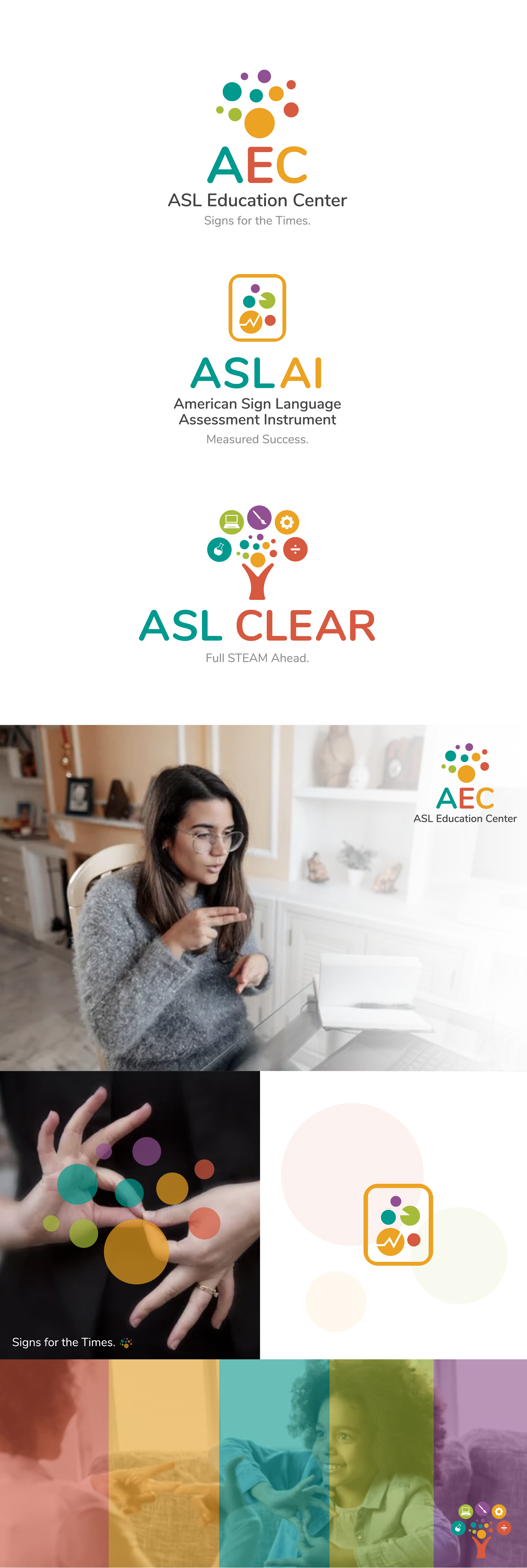
Preexisting logo for ASL Clear
The ASL Education Center needed to have a system of logos and brand guidelines designed for their mother company (ASL Education Center), learning platform (ASL Clear), and progress assessment test (ASL Assessment Instrument). They had a preexisting logo designed for their ASL Clear platform and wanted to base the other two sister logos off those visual elements.
In the refreshed version of the ASL Clear logo, I softened the points and corners of the logo to give a more approachable feel, tweaked the color palette to something fresh and less “primary”, and refined/simplified the icons within the tree so that it is easier to see at a smaller scale.
For ASL AI, I used the circular elements and colors to depict the idea of “tracking and progress” within a tablet (that is how the user will be taking the assessment).
It was important for AEC to be able to stand alone while working as a system with the other two logos. The simplicity of the bubbles alone with no further added elements help bring these 3 logos full-circle (literally). I am really proud of this work and think this was a great solution to a rather complex set of logos that each met their own goal.